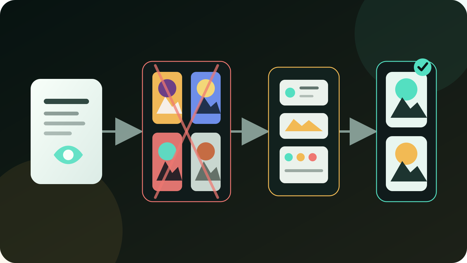
Most weak AI images do not fail because the model lacks style. They fail because nobody checked whether the picture survives the card, the mobile crop, and the page it has to sit inside.
That is how we get the usual cheap result: dark dashboard, glowing lines, fake app cards, random labels, teal dots, amber accents, and a laptop that could belong to any article on the internet. It looks polished for one second. Then it looks empty.
I would treat AI image generation the same way I treat an automation workflow. Input, output, owner, approval point, failure criteria, and rollout surface matter. A prompt is only one input. The job definition is the operating system.
Where the cheap look usually starts
Do not start by asking, “Which image AI is best?” Start with, “What job must this image do?”
| Asset job | Good first route | I would not use it for |
|---|---|---|
| Blog hero with a real-world feel | Real photo, ChatGPT edit, Firefly edit, or Midjourney editorial scene | Fake UI collage with unreadable labels |
| Tool comparison graphic | Ideogram, Recraft, Figma, SVG, or manual layout | Photoreal image with tiny text floating inside it |
| Product mockup | Firefly, Recraft, Canva, or GPT image editing | One-shot fantasy prompt with no brand constraints |
| Mood direction | Midjourney, Krea, FLUX, or Leonardo | Final approval without crop and license review |
| Internal slide visual | Canva, Firefly, Recraft, or simple diagram | Overdesigned cinematic artwork |
| Image critique | Claude, ChatGPT, Gemini, or a human designer | Treating the critique model as the final artwork tool |
| Local controlled workflow | Stable Diffusion, FLUX, ComfyUI, Fooocus | Quick public asset without a reviewer who understands the pipeline |
The best tool depends on the job. ChatGPT and Gemini are useful when you need conversational iteration. Claude is useful when you need critique, brief repair, and image understanding. Midjourney still earns a place for mood and taste exploration. Firefly fits teams already living in Adobe tools. Ideogram and Recraft are stronger when the asset is closer to a graphic layout than a photograph. FLUX and Stable Diffusion make sense when control, local generation, or repeatable pipelines matter.
That is the first practical split. A photo, a diagram, a thumbnail, a product mockup, and a social post are not the same deliverable.
Where the cheap look starts
The cheap look usually starts with one of four mistakes.
First, the prompt tries to solve too many jobs. “Make a premium AI automation image with dashboards, workflow nodes, business people, security, money, and a headline” is not a brief. It is a pile of nouns. The model will glue the nouns together with the most common visual language it has seen: glowing UI cards, shallow depth of field, soft neon, and vague productivity symbolism.
Second, the image includes fake text. AI models are much better at text than they used to be, but tiny UI labels, badge copy, menu items, chart captions, and interface fragments still create trouble. Even when the words are readable, they often say nothing. A public article image with fake copy feels sloppy because the reader can see that nobody approved the details.
Third, the crop is ignored. A 16:9 hero may look fine, but the blog card crop, mobile hero crop, Open Graph preview, and newsletter preview can cut the subject in half. I have rejected decent-looking images because the mobile card only showed a dark rectangle and a lamp. If the subject disappears at card size, the asset failed.
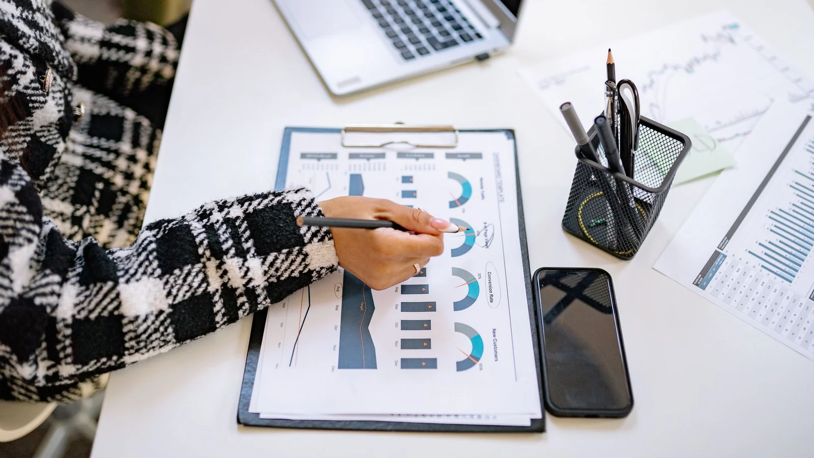
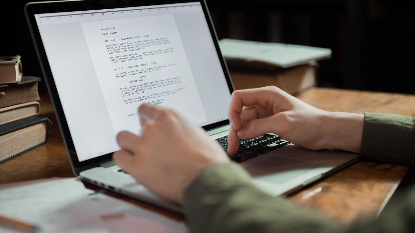
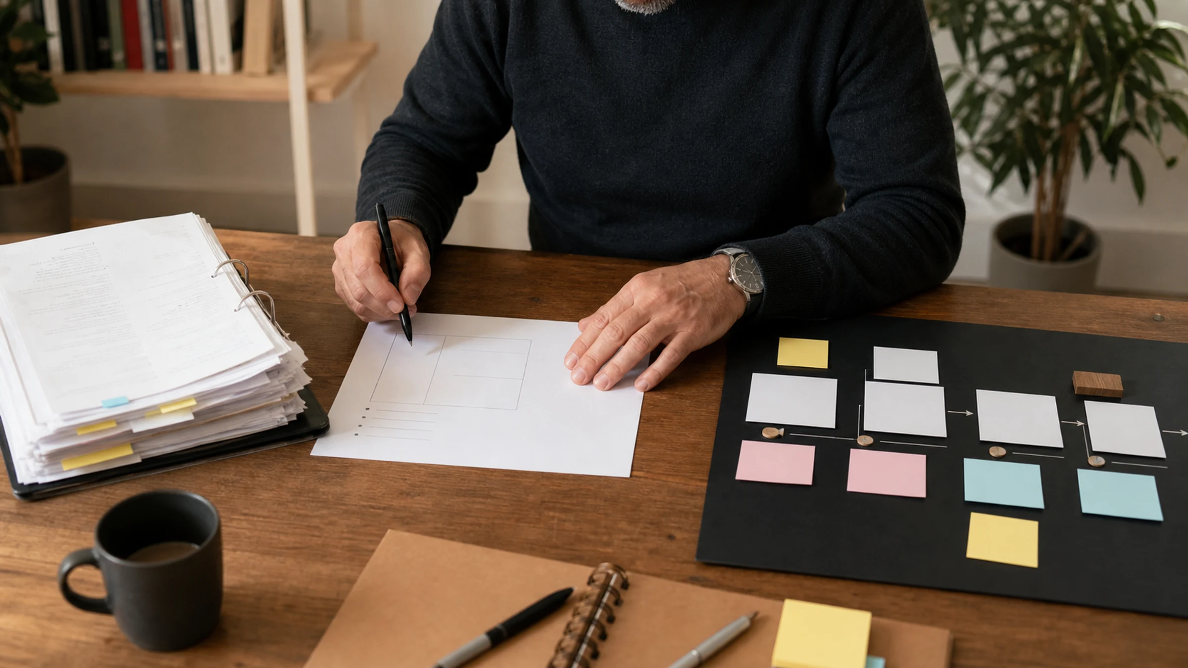
Fourth, the image has no evidence of real work. Real work has paper, tabs, messy file names, review marks, people checking output, old screenshots, rejected versions, and a clear task on the desk. Cheap AI images often have atmosphere but no job.
What each major tool is good for
Here is the operating map I would use before choosing a tool.
| Tool or family | Where I would use it first | Where I would slow down |
|---|---|---|
| ChatGPT Images / GPT Image | Iterating on a brief, editing uploaded images, keeping the conversation attached to the asset | Final brand work without a human crop and text pass |
| Gemini / Nano Banana | Fast multimodal experiments, Google-context work, image generation mixed with search or app context | Assets that need strict brand governance from the first pass |
| Claude | Reading an image, finding visual problems, rewriting the brief, checking whether the asset matches the article | Primary raster generation, unless the product surface explicitly supports that workflow |
| Midjourney | Editorial mood, cinematic direction, campaign art exploration, style discovery | Interfaces, tiny text, compliance-heavy business assets |
| Adobe Firefly | Photoshop, Illustrator, Express, Firefly Boards, commercial creative operations, edits inside Adobe workflows | One-off prompts where Adobe’s production environment is not part of the job |
| Ideogram | Poster-like graphics, text-forward concepts, visual headlines, layout experiments | Photoreal scenes where documentary realism matters more than graphic composition |
| Recraft | Design assets, brand-like layouts, icons, vectors, visual systems | Raw documentary photos or uncontrolled lifestyle realism |
| FLUX / Black Forest Labs | High-quality model exploration, controlled visual pipelines, modern image model experiments | Teams without someone to own model settings and output review |
| Stable Diffusion | Local generation, ComfyUI workflows, custom styles, repeatable variants | Fast public publishing if nobody can manage checkpoints, licenses, and failure cases |
| Canva / Leonardo / Krea / Runway | Fast creative assembly, image-to-video, social formats, non-designer production | Final editorial judgment by default |
Google’s current Gemini API documentation marks Imagen as deprecated and points image-generation work to Nano Banana, so this guide no longer treats Imagen as a current tool choice.
I would not pick a model because it won a screenshot battle on social media. I would pick it because its workflow matches the asset. A tool that makes beautiful mood boards may be the wrong tool for a chart. A tool that makes strong graphics may be the wrong tool for a realistic office scene. A tool that understands an uploaded image may be better as a reviewer than as the generator.
The briefing mistake I see most often
Bad prompt:
Create a premium 16:9 AI image for an article about image generation tools. Make it modern, professional, and high quality.
That prompt sounds normal. It is also almost useless.
Better brief:
Create a realistic editorial photo for a blog hero. Scene: a person reviewing AI-generated image candidates on a laptop and printed notes at a desk. No readable text, no logos, no fake UI overlay, no glowing dashboard, and no maker signature. The image should feel like real production review, not a generic AI concept. Leave enough clean area on the right for a headline crop. Output should still read clearly at a 390px mobile card width.
The difference is not word count. The difference is operating detail. The better brief says what the asset is, where it will appear, what must not appear, how it will be cropped, and what kind of work the scene should imply.
If I were writing the prompt for a comparison graphic instead, I would not ask for a photo. I would use a controlled graphic route: Figma, SVG, Recraft, Ideogram, or a hand-built table. Do not ask a photoreal image model to invent a readable product matrix inside a laptop screen. That is how text spills out of cards and the image looks careless.
My working production flow
For a public article image, I would run a small production flow rather than a single prompt.
- Define the asset job: hero, card thumbnail, body diagram, social crop, or Open Graph image.
- Pick the production route: real photo, generated photo, edited photo, graphic layout, diagram, or screenshot.
- Write rejection rules before generating: no fake UI text, no random logos, no unreadable labels, no generic glowing workflow, no repeated composition from earlier posts.
- Generate or collect 6 to 12 candidates.
- Reject the first pass aggressively. I expect most candidates to fail.
- Test the survivor at article width, card width, mobile crop, and Open Graph size.
- Add alt text that describes the actual image, not the keyword target.
- Convert to WebP, create a hashed filename, and verify the deployed URL returns the new asset.
This is not overkill. It is the minimum process if the site depends on trust. A bad image tells the reader that nobody checked the page. That is the same signal as a broken table or an AI paragraph that says nothing.
The failure signs that matter
I would reject the image if any of these are true.
| Failure signal | Why it matters | What I would do next |
|---|---|---|
| The image contains fake UI copy | It signals lazy production | Remove UI text or build a separate real graphic |
| The subject disappears on mobile | The card becomes decoration | Re-crop or choose a clearer scene |
| It looks like every other AI automation image | The site loses memory and taste | Change scene, camera angle, or asset route |
| It uses logos without a reason | Brand and policy risk increases | Use neutral references or official brand assets correctly |
| It shows a workflow that cannot be understood | The image adds noise | Replace with a simple diagram |
| It has glossy neon but no real task | It feels generic | Add a work context: review, selection, handoff, approval |
| It depends on tiny text | Readers cannot inspect it | Move the text into HTML or a proper SVG |
| It uses a model only because it is trendy | Tool choice becomes fashion | Match the model to the asset job |
The hardest failure to catch is repetition. One good dark desk image is fine. Ten dark desk images make the whole site feel automated. I keep a simple rule: every new hero image needs a different scene, not just a different overlay.
When I would not generate an image
Not every article needs a generated hero.
If the article is about a real product UI, I would rather use a licensed screenshot, official product image, or a neutral work photo than a fake dashboard. If the article explains a process, a clean diagram may beat a cinematic render. If the article compares pricing, a table in HTML is safer than a generated “pricing screen.” If the subject is sensitive, regulated, medical, financial, legal, or political, I would be careful with synthetic scenes that imply people, companies, or outcomes that never existed.
Generated images work best when they support the article. They fail when they pretend to be evidence.
That distinction matters for AI content sites. Readers already suspect synthetic filler. A clear photo, a plain diagram, and honest alt text often feel more premium than a dramatic generated image.
A practical route for this article
For this page, I would not use a glossy generated workflow overlay. The topic is image quality. A fake AI image about bad AI images would make the article contradict itself.
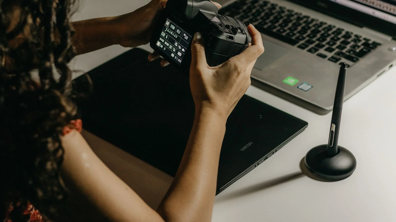
The better route is a realistic production scene: a person working with a tablet, laptop, and visual material. It signals selection and review without pretending to show a real product interface. The image is not doing the argument by itself. It sets the context; the article carries the judgment.
If I needed a body graphic, I would build it as a separate readable diagram: tool on one axis, asset job on the other. I would not hide that matrix inside a generated laptop screen.
What I would not skip
Here is the decision I would make in a normal week.
Use ChatGPT Images when I want to iterate in conversation and keep changing details. Use Gemini when the image task is mixed with Google-side context, quick exploration, or multimodal input. Use Claude when I need a blunt reviewer: “what looks fake, what is unreadable, what does not match the article?” Use Midjourney when I am searching for a visual mood. Use Firefly when the final work will move through Adobe tools. Use Ideogram or Recraft when the asset is close to design, poster, or layout work. Use FLUX or Stable Diffusion when I need more control and I have someone who can own the local or technical pipeline. Use Canva, Leonardo, Krea, or Runway when speed and format assembly matter more than deep production control.
Do not choose a model because it made one impressive sample. Choose the route that reduces review burden.
Checks before using the image
Is ChatGPT better than Midjourney for blog images?
Not by default. ChatGPT is convenient when the brief keeps changing and edits matter. Midjourney can still be stronger for mood and visual taste. For blog images, the better question is whether the final crop, subject, and visual role are clear.
Should Claude be listed with image generators?
I would list Claude in the image workflow, not as the default generator. Claude is useful for reading images, spotting weak composition, rewriting a brief, and checking whether a visual matches the article. That review role can save a bad asset before it reaches the page.
Are AI-generated images bad for SEO?
The image itself is not the whole issue. Thin pages, generic visuals, missing alt text, slow files, repeated thumbnails, and misleading images are the bigger problems. A useful article with a clear image and accurate metadata is in a better position than a page full of decorative AI art.
What is the safest image workflow for a monetized site?
Use a real photo when realism matters. Use generated images when the subject is conceptual. Use HTML tables or SVG diagrams when structure matters. Keep licenses, alt text, file size, crop, and source notes in the publishing checklist.
What should I stop doing immediately?
Stop putting fake UI overlays on every article card. Stop asking for “premium SaaS dashboard” without a real task. Stop approving images before seeing the mobile crop. Those three habits explain a large share of cheap-looking AI visuals.
References and reporting
Public pages used for reported facts, official documentation, policy background, product details, and claims that may change.
- The new ChatGPT Images is hereOpenAIUsed for: ChatGPT Images positioning; editing and instruction-following contextChecked: 2026-08-25
- Introducing ChatGPT Images 2.0OpenAIUsed for: current ChatGPT Images 2.0 release context; official interactive output galleryChecked: 2026-08-25
- Nano Banana image generationGoogle AI for DevelopersUsed for: Gemini-native Nano Banana image generation; Imagen deprecation and August 17, 2026 shutdownChecked: 2026-08-25
- Claude Vision documentationAnthropicUsed for: Claude image understanding and critique roleChecked: 2026-08-25
- Midjourney Version documentationMidjourneyUsed for: Midjourney model contextChecked: 2026-08-25
- Adobe FireflyAdobeUsed for: Firefly production workflow; partner model contextChecked: 2026-08-25
- IdeogramIdeogramUsed for: graphic and text-oriented image generation contextChecked: 2026-08-25
- Black Forest LabsBlack Forest LabsUsed for: FLUX model contextChecked: 2026-08-25
- Introducing Stable Diffusion 3.5Stability AIUsed for: open model and customization contextChecked: 2026-08-25
- RecraftRecraftUsed for: design asset and graphic generation contextChecked: 2026-08-25
- Pexels photo 16313515Pexels / Kawê RodriguesUsed for: featured imageChecked: 2026-08-25